A clear photo to work from
Looking at a number of photos, each will have it’s own appeal. I find the appeal comes from the position and expression of the figure. What is particularly important though, especially if you are starting out painting, is having good light and shade in your source photo. I particularly like side lighting on a figure. Lastly, Before you start working from a photo, make a decision as wether it lends itself best to a portrait or landscape composition. You also need to decide if you would like to crop or leave out unnecessary detail.
Interpreting rather than copying the photograph
Photographs universally distort a scene in a particular way, which is often identifiable on realist artworks. Amongst the characteristics a camera imposes on an image are: the flattening of tone, loss of shadow subtleties, intensification colour and interpretation of edges as sharp or soft according to the focus of the camera lens. The human eye, in contrast to the camera lens, will tend to focus on a persons face and leave the periphery of the scene unfocused.
When I paint from photos I consciously re-calibrate the focus of an image as well as the other characteristics I have listed above. In particular I find introducing soft or lost edges important for composition. Which lines I emphasize are chosen to lead my viewer’s eye to a focal point. I aim to re-introduce liveliness and movement to a flat photo by using evident brushstroke and manipulating colours in the resulting painting. This makes an essentially reality based image slightly abstract.
I find the more advanced I become in painting, the more confident and capable I am of using the photo as a reference; as opposed to laboriously and unimaginatively copying. Combining photos into a new composition, moving or intensifying shadows, losing edges and leaving out details are all important strategies I use when working from a photo.
Background
Generally speaking, when creating a background it is important to remember it is a background, and make sure it does not take away from the main subject.Many of my paintings are simply studies on a white background. I generally decrease the detail and fade the clothing and hair out toward at least one of the edges. However, sometimes I will choose to include the background to tell a story that enhances the subject. The environment your figure is in will say something about their personality, experience and interests. Painting a child I might choose a typical activity for a child incorporating props that suggest play. Alternatively I might set my daughter in a place, such as the beach, where the child becomes engrossed their environment.
Applying to colour scheme to create a magical mood
You do not have to paint the exact colours you see on the photo but can interpret it according to the mood you want to portray. While it is tone and composition that makes a successful painting, colour is the most emotionally powerful factor. Though colour associations are somewhat individual, universally speaking pastel colours will be perceived as peaceful, bright colours energetic and dark tones tend to have a sobering affect. One thing to keep in mind when setting your colour scheme is that a limited colour palette will make your painting process easier and finished painting more cohesive.
edit.
An Example:
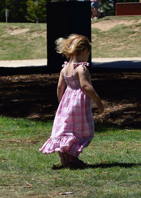 | 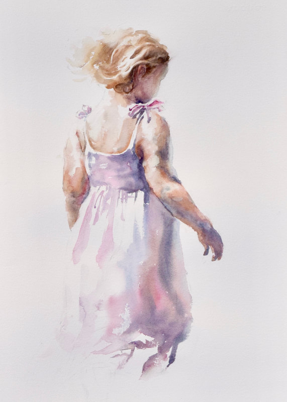 |
This photo the figure has lovely lighting and delightful posture, but the background is far too harsh and distracting. I decided to leave out the background all together to make the image more about the figure. Interpreting the figure I used a limited palette with little tonal variation and soft analogous pastel colours. The qualities of softness and lightness are further enhanced by lost edges. My brushstrokes become particularly loose and gestural on the clothing which fades into the background.
