Using a photo as reference rather than copying it
It is easier to achieve a successful watercolour painting by starting with a suitable reference photo. Just because an image is not a ‘good’ photo in itself, it does not mean that it can’t be used to make a ‘good’ painting. This is because you can consciously choose to paint differently to the reference photo. You can crop, move objects, adjust or balance colour, sharpen or blur edges and perhaps even introduce a new colour scheme.
Don’t be a slave to reproducing the photo. Give yourself space to apply your own style in the way you choose to paint the photo. One suggestion to help you move away from directly copying a photo of your is to print the photo in black and white. This can help you better see the tonal values and provide you with an opportunity to introduce your own mood through colour scheme.
Choose a photo simple to work from
When you pick up a photo to paint the first thing you do is analyse the steps and techniques required to paint it. This varies considerably from photo to photo. Not only do some photos make better compositions than others in general, but some are easier for a beginner painter to work with. This is because images vary in the level skill and experience required to execute them. The more you are concentrating on ‘what’ you are painting (the subject) the less responsive you are to the technical process of putting paint on paper. That is: application of paint, getting your ratios of water and paint correct as well as having your palette organised and ready. Choose your photo carefully then think ahead about what you need to change, add or simplify to get the painting you want.
Questions to consider when determining if a photo is easy to paint from:
- Do you need to practice your drawing skills to capture the perspective and proportions of this composition?
- Does the composition lead the eye to a focal point at an intersection of the golden thirds?
- Does the composition have simple one point perspective?
- Is there a mid, back and foreground to suggest perspective?
- Is the sky busy with many clouds and colours or is it simple?
- How many individual elements, or 'things' does the photo have? If it has a lot, can these be merged to create unity and simplicity in the design
- How complex are the individual elements in your painting? ie. boats, figures, animals waves rocks and cliffs tend to be challenging and you may need to practice these
- How many colours will I require to paint this and should I be simplifying it and introducing a colour scheme?
- Can I use mostly transparent non-staining paint colours, which can be removed if necessary?
Complexity level analysis of photos to paint
A simple photo
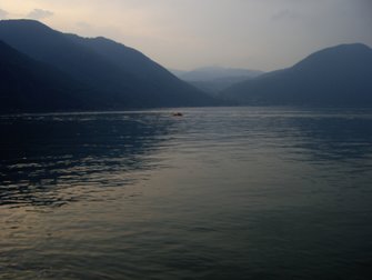
This photo would be a good one to start with for the following reasons:
- Doesn't have many elements (things) meaning it is relatively simple to draw and you don't have too many things competing for your attention when you go to paint it. This means it is easier to plan ahead
- It is almost monotone, or could be done easily monotone to simplify the process
- If painted in colour, the colour scheme is already cohesive
- It shows a range of tones with hills getting smaller paler in background creating a clear sense of perspective
- The sky is simple as the clouds can be painted over a graduated wash
- It requires a series of graduated washes and the only brushwork detail is ripples
- The sunset lighting means the photo has 'mood' which you can tap and enhance as you paint
- You may choose to make it more interesting with a boat silhouette in the mid-ground
A complex photo
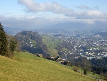
This photo is complex for the following reasons:
- The sky has many voluminous clouds of various sizes and colours to be painted in one wash
- The angle the photo is unusual as it is taken from is from above
- It has many elements (things) within the composition, it would be easy to get lost in the detail of lakes mountains clouds and houses
- The main focal point (foreground houses) is not clear because the tree on left edge of image dominates. The houses would need to be made bigger
- White in mid-ground houses draws the viewers eye away from focal point making it harder to achieve perspective
- You have a wide range of colours to integrate into your colour scheme
- When you have man made structures such as houses it is essential they are drawn with straight lines and realistic perspective.
How to prepare for complex images to paint
If you do initiate a painting that has a complex resource photo, I suggest you go through a process of preparation. That includes planning the sequence of required techniques ahead, compositional thumbnails, tonal sketches and colour sampling. Furthermore I suggest practicing the brush strokes required to portray the elements, or things, within your image with finesse. Consider re-organising or simplifying the composition. You may also experiment with a different colour scheme or edit out some elements.
Complex does not mean better
A complex scene does not necessarily mean a better and more advanced painting. When you are in the depths of a difficult composition you may find yourself in ‘damage control’ mode. That is reacting to the unexpected ‘mess’ in front of you rather than thinking clearly and carrying out a planned series of steps while exploiting the exciting spontaneous effects of the paint that pop up. Taking on an image that inspires you deeply but is highly complex can be disheartening when things don’t go smoothly.
A complex composition in a photo that looks good does not mean it will make a great painting as the medium of photography captures things in a different way and has a different aesthetic to watercolour. Simple photos can make excellent paintings as the mood or message within that image is more concentrated.You are better off doing something simple well and feeling relaxed while you are doing it than struggling and being disappointed when you are finished. In brief, choose the right resource image to set yourself up for success.
